SOFR First Slowly, Then All at Once: Measuring the Market Transition from LIBOR

Jonathan Rick
Director of Research, Tradeweb
The dealer-to-dealer market’s switch towards the Secured Overnight Financing Rate (SOFR) this summer galvanized broader acceptance of the new risk-free benchmark in swaps and was a watershed moment for building liquidity. Where regulators had struggled before to build momentum in the transition away from LIBOR, the July 26 “SOFR First” initiative accelerated SOFR linear swap trading. In the ensuing months dealers have gained a whole new level of comfort trading SOFR-related instruments with their clients. With today’s switch in the dealer-to-dealer market to SOFR for non-linear derivatives, we wanted to better quantify the market’s progress in SOFR adoption.
Aside from rising OTC volumes[1], there have been clear improvements in a number of key indicators Tradeweb follows to gauge market transparency and liquidity. Using streaming indicative price data, this blog will dive deeper into liquidity metrics to better explore SOFR adoption trends and dealer engagement. These include bid/offer spreads (BOS); dispersion of yields; level refresh rates; yield change per refresh; and indicative quoted size of SOFR and London Interbank Offered Rate (LIBOR) swaps.
Our model includes streams over 30-minute windows from top dealers who contribute levels on both SOFR and LIBOR. For each metric (except rate dispersion[2]), we take the difference between a given dealer’s SOFR level and its LIBOR level and then average it across dealers.[3] We used streams that simulate an order book to better observe the ebb and flow of liquidity.
Bid/Offer spreads
Though the transition away from LIBOR was not likely to happen overnight, we’ve started to see SOFR median BOS improve compared to LIBOR spreads over the course of this year. Typically, BOS are a good indicator of market liquidity as they reflect the implied cost of liquidity for market participants.
Since the start of the year we have seen a fairly linear trend towards tighter BOS in 2-year SOFR compared to 2-year LIBOR. Meanwhile, in 10-year and 30-year SOFR swaps, we witnessed significant tightening of the spread soon after the July 26, 2021 announcement. We postulate that higher liquidity for OIS swaps in the front-end explains why SOFR First was such a watershed moment for the longer-term swaps unlike the 2-year swap.
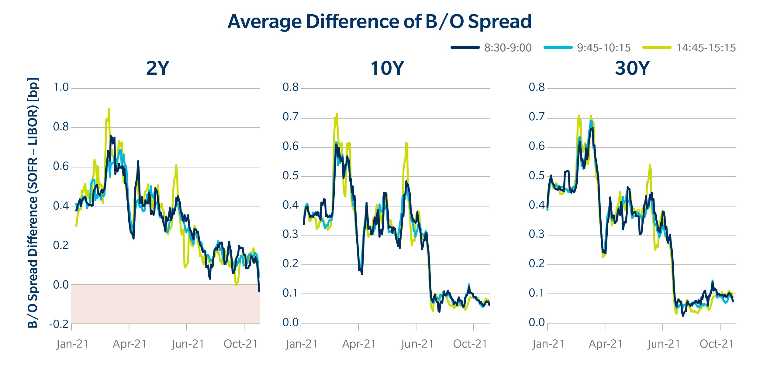
It’s true that when the equity markets sold off in September of this year, SOFR liquidity fared worse than LIBOR liquidity. Still, the relative widening of SOFR BOS was far less than we saw earlier in the year, including during the bouts of volatility in June. SOFR bid/offer spreads on average are still a bit wider than those of LIBOR, but the progress is encouraging.
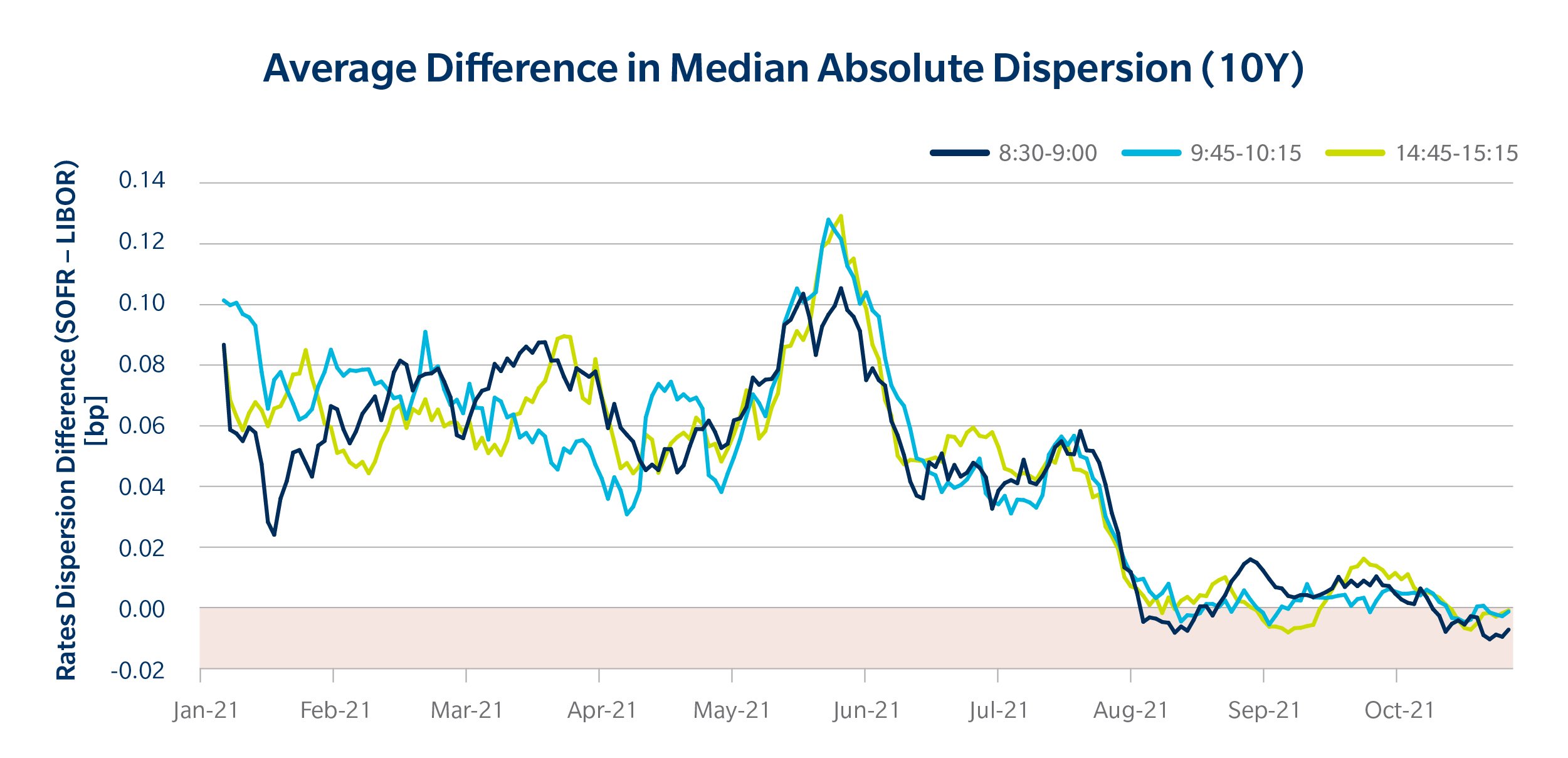
Rate dispersion
In more liquid and transparent markets, bids and offers typically hover tightly around a market midpoint. There’s usually common agreement, with slight variations, to what the “fair” price is for a given asset. When there is more dispersion amongst quoted prices, it suggests that the market itself is less liquid and the market is less certain of a common, prevailing value for an asset.
We measured the median absolute deviation of mid-yields in the SOFR and LIBOR market and since July found a dramatic reduction in the amount of variance of SOFR rates. SOFR dispersion rates are now roughly in line with those of LIBOR.
Refresh rates
Another way to gauge liquidity is by looking at dealer refresh rates on quoted prices. The more frequent the price updates the “fresher” the market and the more active dealers are on particular instruments. We’ve seen general improvement this year, with more frequent updates in SOFR prices. Nonetheless, SOFR swap levels are still being updated less frequently than LIBOR swap levels.
Interestingly, the refresh rate for SOFR is noticeably better earlier in the day. They tend to slip in the afternoon around futures and Treasury market closes, though market liquidity tends to be more concentrated then.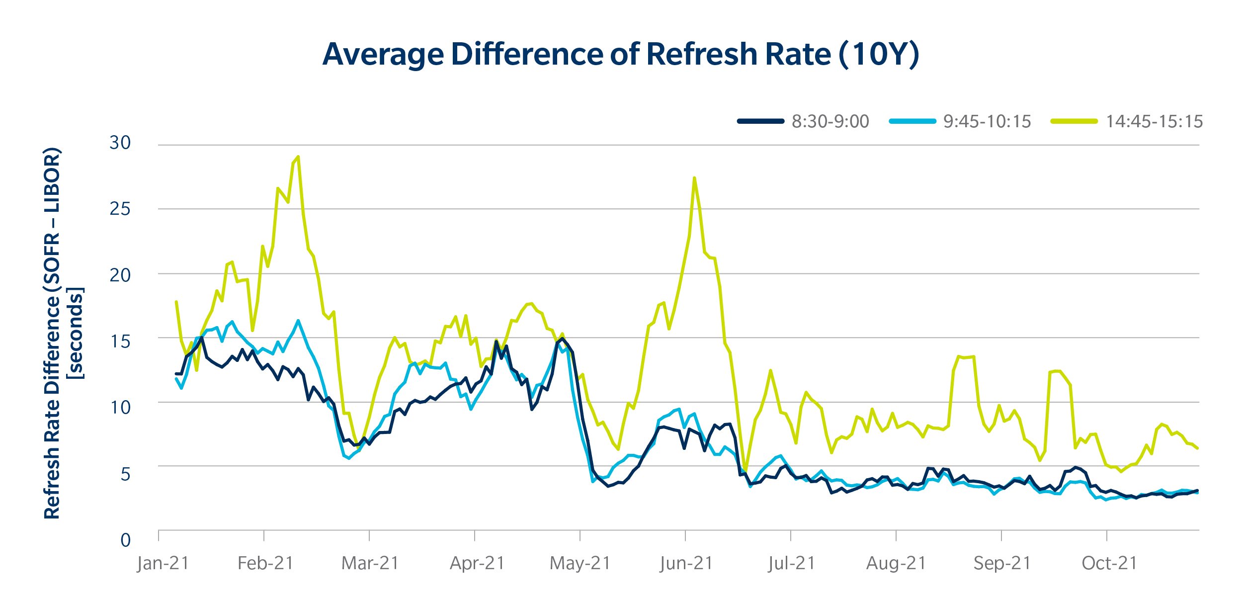
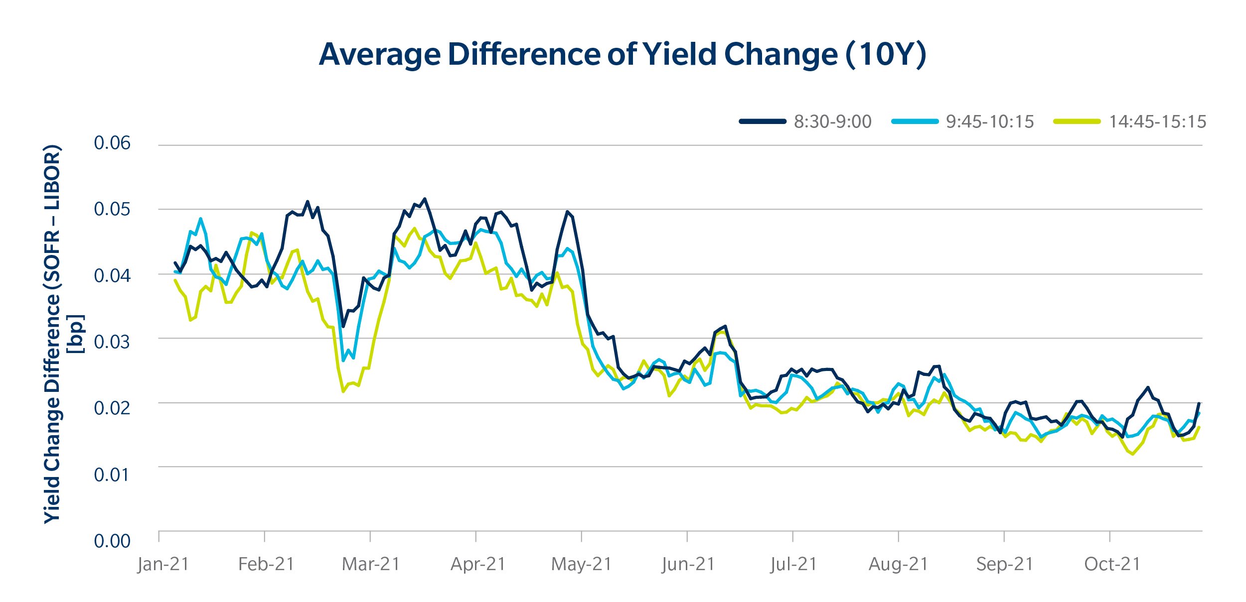
Yield change
In addition to the frequency of price updates, looking at how much the price changes at the time of a refresh also provides information about liquidity, similar to tick size. A smaller incremental change in price between refreshes suggests that a market is more resilient to changes in trading dynamics and can better digest new information. We have seen a steady decline in the size of these incremental yield changes for SOFR swaps when compared to LIBOR swaps. Further, it looks like the trend is continuing towards further improvements for SOFR swaps.
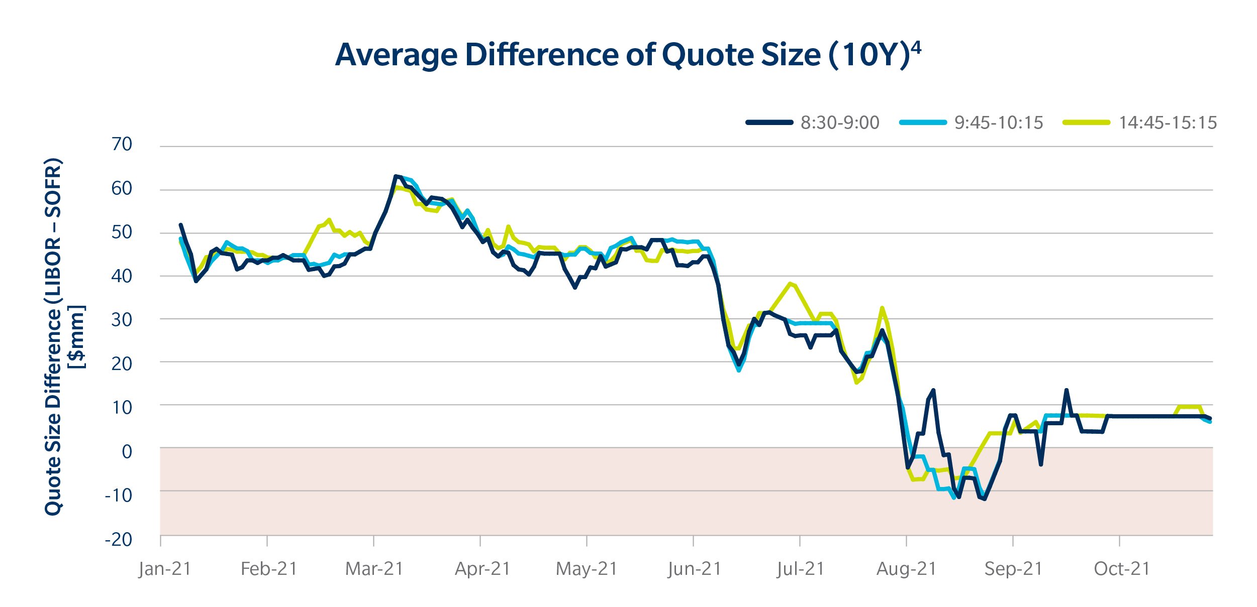
Quote size
Although the streaming prices we are looking at are not “firm prices”, they do indicate how big of a trade can be executed at a particular level, like an order book would. An increase in quote size tells us that dealers are getting comfortable handling bigger trades. Since July, there has been a noticeable jump in the size of quoted SOFR swaps, showing again how the switch to SOFR in the dealer-to-dealer market has had the desired effect of promoting liquidity across the market.
Conclusion
If SOFR trading needed jump starting to improve liquidity and change how the market engages with the new reference rate, SOFR First in the inter-dealer market seems to have done its job. Liquidity has continued to improve in the SOFR swaps market this year, particularly after July 26. And while LIBOR activity still far overshadows SOFR trading, the momentum we’ve seen is encouraging.
Related Content
RFR Resource Center
The Story SOFR: Institutional Adoption of New RFRs
Ten Days Later: Some SOFR First Observations
[1] Visit Tradeweb’s RFR Resource Center for the latest stats on RFR adoption.
[2] For rate dispersion, we took the median absolute deviation of SOFR and LIBOR rates across dealers and used the difference of those two values.
[3] To make graphs easier to read we used five day rolling averages.
[4] N.B.: This chart shows LIBOR quote sizes minus SOFR quote sizes, so lower numbers indicate improved liquidity. This was done to align with the other charts.